First I did Romance covers and how much I hate naked people on my book covers (yech, like really?), and now I go into International Covers!
What I mean is covers that are done different for a -one- book depending on which country the book will be sold in. For example:


Italian - North American - Bulgarian


Dutch - Portuguese - Italian


Greek - Japanese - Turkish


Korea - Germany
And this is not unique to Vampire Academy. Take a look at the Harry Potter International Covers (below) or Twilight series. Never mind the various Neil Gaiman's and such.


So... what is the deal with all these different covers?
A few theories have been floated towards me: (1) Different publishing houses in different countries want the book to appeal to the widest audience possible; (2) support for native artists; (3) Pure preferences. Etc. I am not sure what I think of these arguments, really. I just know that I am usually very jealous that I don't live in the UK. They always seem to have the best covers.
I stumbled on this article while looking for a particular book cover (If you must know, it was the Korean version of Vampire Academy that caught my attention). It talks about how some countries try and express different parts of the novel: The US may highlight the historical aspects of Wolf Hall, where the UK may highlight the theme of it. I tend to agree, however, with this line of reasoning: (Call me a cynic...)
There are colder business reasons for creating jackets that differ by territory, says Julian Humphries, head cover designer at Fourth Estate: "Different sales channels have different sensibilities." It can be hard to pinpoint what exactly these sensibilities are – "It's a cultural thing," he says, "as taste-driven as different countries eating different things for breakfast" – but broadly speaking, literary fiction is an easier sell in mainland Europe than in the UK or the US, so publishers there can be less overt in their attempts to grab the attention of customers. "In Europe you often see book covers with simple images and plain type, and that sells books for them," says Burton, whose colourful design for A Fraction of the Whole by Steve Toltz stands in stark contrast to the black-and-white German edition. "The UK book market is more competitive, all the covers in shops shouting: 'Buy me!' We have to put on a bit of extra spin."
Yes, I am one of those who sides with the profitability of it, to be honest. I think that publishing houses are in it for the cash - and they would not invest money into a new cover if there wasn't some return for them. So it becomes suddenly a discussion of - are our cultures so different that covers in, for example Sweden - would be completely unprofitable in America? Despite the best seller status of the book?
Exhibit A.
http://online.wsj.com/article/SB10001424052748704220704575367202148711296.html
http://knopf.knopfdoubleday.com/2010/05/27/jacket-journey-of-stieg-larsson/
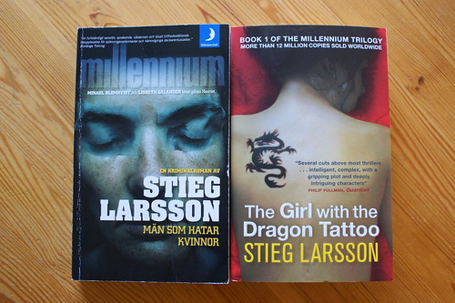
Girl with a Dragon Tattoo (American). The original title is "Men Who Hate Women" (translated from the Swedish) and the original cover is
definitely not the same ... picture of an abused woman (and yes, I think it is also significant that the title changes when it came over to this side of the Atlantic, too) as opposed to a healthy girl with a minuscule tattoo (ha ha ha) or the bright yellow one I have.
I have read a few things that claim that a picture of an abused woman makes North Americans uncomfortable, and so leaving the cover as it was, would be a bad decision for the book publishers here. That has a few implications, but let's take that at face value and just ask: why?
The answers are varied, I think - partly due to socially conservative governments, culturally conservative people and I guess, the opposite of all that, book covers have become a new political tool.
Thoughts?
Cheers
Ammy


No comments:
Post a Comment