
If you're interested, see:
http://thebooksmugglers.com/2010/02/cover-matters-on-whitewashing.html
http://thebooksmugglers.com/category/smuggler-specialties/cover-matters
Now, for my first homage, I am going lighter - real lighter. I will address a pet peeve of mine that has to do with ... ROMANCE covers. Yes. Romances. And Fabio. The two seem to always go hand-in-hand, particularly those ones from the '80s that I snuck off my Mom's book shelf at the age of 12 to begin reading. Oh what a twisted kid I am ...
Now, here's the thing - I am not a prude. Like, seriously, definitely not a prude. Nudity, sex - simulated, implied, graphic, whatever - scenes, suggestive language or situations - they don't bother me, and in fact I think that in order to demystify sex and more importantly, the way young girls view sexuality, there needs to be an openess about all these things so it is not forever regulated to the adjoining chambers of Shame and Remorse. That being said - I hate the fact that my romance novels have naked torsos on them.
Here are some examples:


I use the above since I liked all those books - regardless of the distaste I have for the covers. Now I have realized that my preference and pet peeve reflect more about me then about what is appropriate maybe, but let's give this a shot, shall we?:
(1) The Sex Scene.
I love Steam Scenes. Love them. I think that half the reason I picked up "So Worthy My Love" when I was 12 was because it promised to have a wicked sex scene for the clandestine pleasure of my adolescent eyes. And hell, when I want to feel that rush - I pick up my favourite romance books and thumb to the sex scene to just sigh wistfully at perfection. Tee. (I recommend these books - for funny, charming and hot scenes: "Random" by Julie Garwood, "Three Fates" by Nora Roberts, "Say No to Joe?" by Lori Foster, and anything -really, anything- by Sunny).
So, it is well established that the sex scene and me are twined about the hips, and I will relish each word as it forms a picture in my mind ... sigh.
But I hate seeing sex scenes.
Even in movies - it really does have to be done so well that I don't either roll my eyes (I do this way too much ... see any movie that has a sex scene with comedy - ugh, I hate romantic comedies) or sigh in frustration (frustration because it's too unrealistic, not because I am suddenly sexually frustrated) . I like the scenes in "Original Sin" for example. It's rawer then Hollywood's usual, and I like that. Also of note are the scenes in "The Notebook" and "Mr. and Mrs. Smith".
But on Book Covers ... It just makes me irritated for some reason. Let's explore that. First off, you get the 10 year old boys who sneak glances at your cover on the subway. This doesn't irritate me so much as make me want to start reading out loud and watching their pudgy little faces flame into redness. Being in Canada - even in Toronto which is pretty awesome with the whole libertine thing - I can imagine what kind of Puritan hell on earth would await me when I looked up from my speech to meet the eyes of WASPy mothers and Uber Religious crazies who have condemned me like Socrates - corrupting the youth... sigh. Sometimes I wish those people would focus less on their children's abstinence and more on their children's behavioural issues - like, oh, I don't know - bullying and weapon carrying and gang joining like behaviours? That seems a lot more degenerate and counter cultural then consenting sex, right? (According to the vast opinions of North America, I am wrong. See "Gladiator" - lots of violence, sex only on the borders, rated PG).
So, it's not that people see it so much as ... the actual image makes me uncomfortable -and not in a good way. I don't look at it and think, "Where's that boyfriend of mine? I suddenly feel hot!". I look at it and think "Why do they look half dead?" Like, seriously.
Take this for example:

"Intrigued" Beatrice Small
A great book! But the cover drives me nuts! And he isn't even the Fabio.
Anyways ...
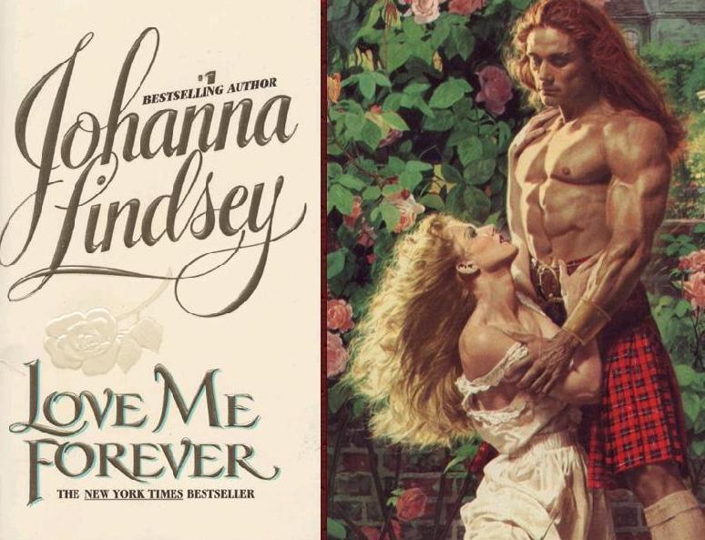
Dissection of a Romance Cover, Version 1.0:
(i) The Heroine's attire: Her boobs are spilling out. Yep. I don't mind so much - I even like the dress. Would wear it myself if it were a costume party. But look at her hair how it flows. Unrealistic much? Maybe. Either way, it's probably drawn like that to make it look more attractive. So, she gets a pass, even if the entire scene makes me a tad icky.
(ii) The Hero: Blegh. First off let me give credit to Smithy for introducing me to the term "Fabio Stunner" - it's reference to books that have seemingly neutral covers and then bam! You turn the page and get a full load of Fabio, buttons undone, chest not so much peeking out but glaring out, challenging anyone looking that they have a bigger, broader chest with less hair on it .... yeah ... moving on ...
This hero is apparently some well to do, posh type (no such thing in romance novels ...) and his hair is driving me nuts. I know, it was penned in a time when bowl cuts and John Lennon were still very much the thing. But ... bleh, I do not understand it. Anyways, it's not so much the hair as the yellow for me. So pale ... anyways.
I also hate the fact that 90% of them (Heroes, I mean) look the same. They do! They all look like steroid pumped chiseled jaw types with longish hair and eyes at half mast. There is nothing wrong with that look. It just sucks that it is on every single cover! (I like my men with lean muscles, shaggy hair and nearly always smiling). How is it supposed to appeal to women in the general sense if they all look the same? I don't get it - and I must admit, this may be one of my biggest problems with the Fabios. That and they usually have long creepy fingers. Yech. Reminds me of this guy at school. We'll call him EK.
(iii) Faces: She's asleep. She looks raptured, but let's face it - girlfriend fell asleep. Or she was drugged ( you can tell I'm a city girl, right?). Dude looks like he's sneering (sorry about the resolution - you can look it up yourself though - this was the only one I found that was just the picture). The "sneering" is actually just him pulling his cheeks in to create the illusion of high cheek bones. Either way it looks like he's either about to mistreat her or he's going to suck her up in one bulemic-like binge session (Mmm, I like me Brunette smoothies?). They aren't even looking at each other - which makes me kind of queasy too - since it is all about the love, right? And throughout the book there will be a million and two references to "Looked into his/her eyes" etc. But on the cover ... only sleepy and hungry people need apply.
(iv) The posture. You knew this was coming! And come on, don't deny it - the fact that like 70% of romance covers have the girl facing you (the better to ogle boobs with, my dear) and the guy behind her (looking posessively hungry - "My three piece meal!") makes me think this is just wrong. Not because sex in this position is wrong (it's not, trust me) but because it looks like he's muscling her into something she's too drugged up for. I won't even complain about other covers that look like the models were strange contortionists! Just this - the obvious strength of the ginormous male and the petit female cowering - back to him, shorter, or even on her knees sometimes.
The Verdict: The cover isn't so bad in terms of sexuality (they are both fully clothed) and yet it still bothers me. I think the reason that this is the case is that the male is generic (with a bad haircut) and the positions of the body and sleepy faces makes me think he's forcing her - and that takes away from the romance of it.
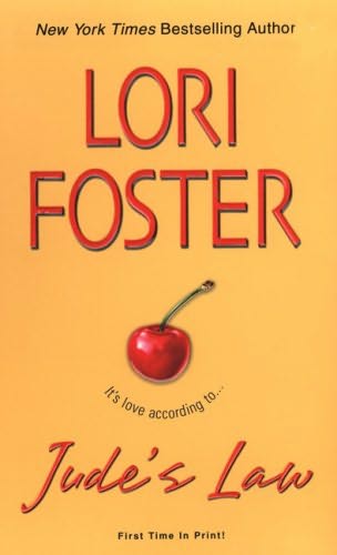
(2) The Naked Male Chest
Ugh. My current pet peeve since one of my favourite authors ever, Lori Foster's books keeping coming out with just a chest as a cover. A chest does not a cover make, people! Yes, I see they have abs. And pecs that could probably pulse to music. But they're indistinguishable and kind of boring, to be honest.
Though, it does have a weird counter-benefit. These covers have essentially reduced men to things - OMG! We're objectifying men! (Anyone - I mean ANYONE - who thinks this is viciously wrong, morally deplorable and unjust - I direct you to Hooters, bikinis, V-neck tops, the rise of Plastic surgery in America, Pamela Anderson and the rising eating disorder rate among young women - "young" as in, children as young as 8 or 9). I personally see nothing terrible about objectification - when it is understood that it is in fact, objectification, and therefore, an incomplete picture of a person. I wear heels, push up bras and do pilates to make my tummy flat and my ass perky like the rest of them. I understand that when I was in highschool and I wore my kilt high, I was essentially allowing the creepy men on the subway to look at my legs and objectify me ("Hey! Boobs!" was once a greeting I got - I kid you not, from the then-boyfriend, now husband of a friend of mine when I was at a wedding (not theirs) wearing a low cut dress). At the same time - I alternatively ignored it or bitched about it, usually using something to objectify back ("Hey! Beergut!"). That may be wrong, it may not be wrong - who knows? (It's wrong, yeah yeah yeah - I know). The point is that I am aware of that.
The male chest, I guess, for me is irritating on Romance covers because it conveys one thing only: There is sex in this book. Read me: Contain sex. And I reached the point (oh, around 15) when I realized that most romance novels have more then just sex - like a plot! And witty dialogue! And to show just the male chest is akin to saying "The novel was a story about a man, a woman ... a bed... oh wait -a counter?" Instead of actually saying "This is a work of literature about the sexual and emotional relationship between a man and a woman in the context of ...".
I love romance. I want to promote it. This is not the way - it just plays into stereotypes.
Again, personal opinion :)
(3) My General dislike of realistic looking people on the cover
Okay, another bias you should all be aware of - I hate realistic people on covers. Hate. Why? Well, I have a great imagination - I like to see my characters int he flesh in my head, without any help from an artist's head. So, when it comes to realistic people on covers - only bios and memoires, please!
I am of course assuming these are realistic .... a giant man and a tiny woman - both impossibly fit and miraculously proportioned ... etc etc etc.
(4) The Alternatives.
THERE ARE SO MANY! Here are a few:


Why not use one of those - subtly imply what may be inside the covers? Creative, no? I think so.
In closing - Covers matter. Do not deny it! I know some of us out there buy a book twice because the cover is prettier in time. And I know some of us will wrap our books into poster paper to get ride of the ugly cover. And I know I at least, judge my impulse buy books based on the cover. I mean - if the company thinks it's a good book, they will pay to have a great cover, right?
Yours,
Cheers!
xo
No comments:
Post a Comment